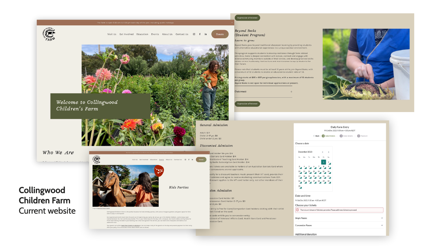
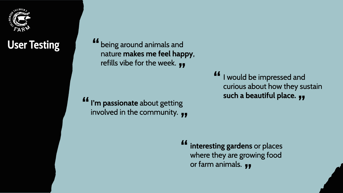
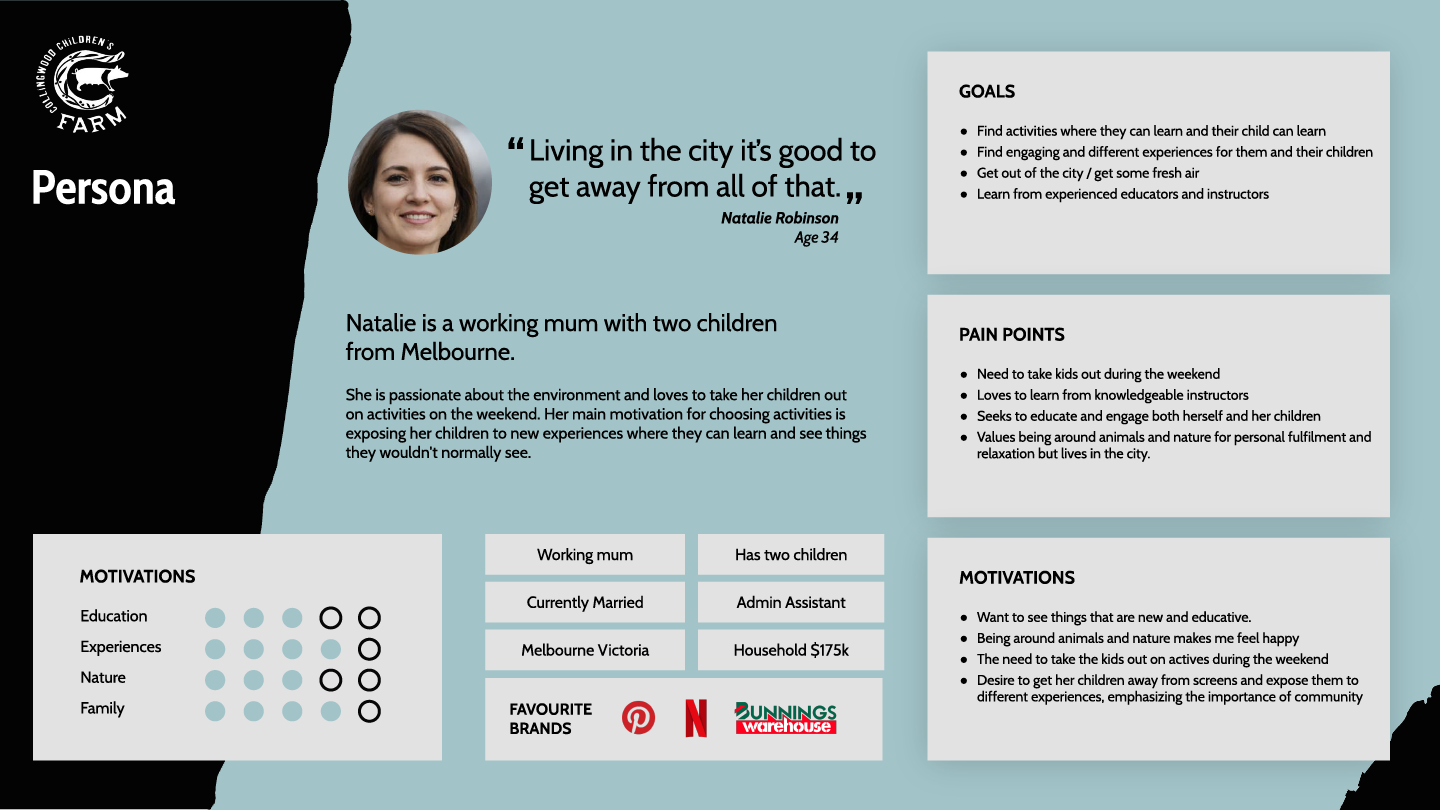
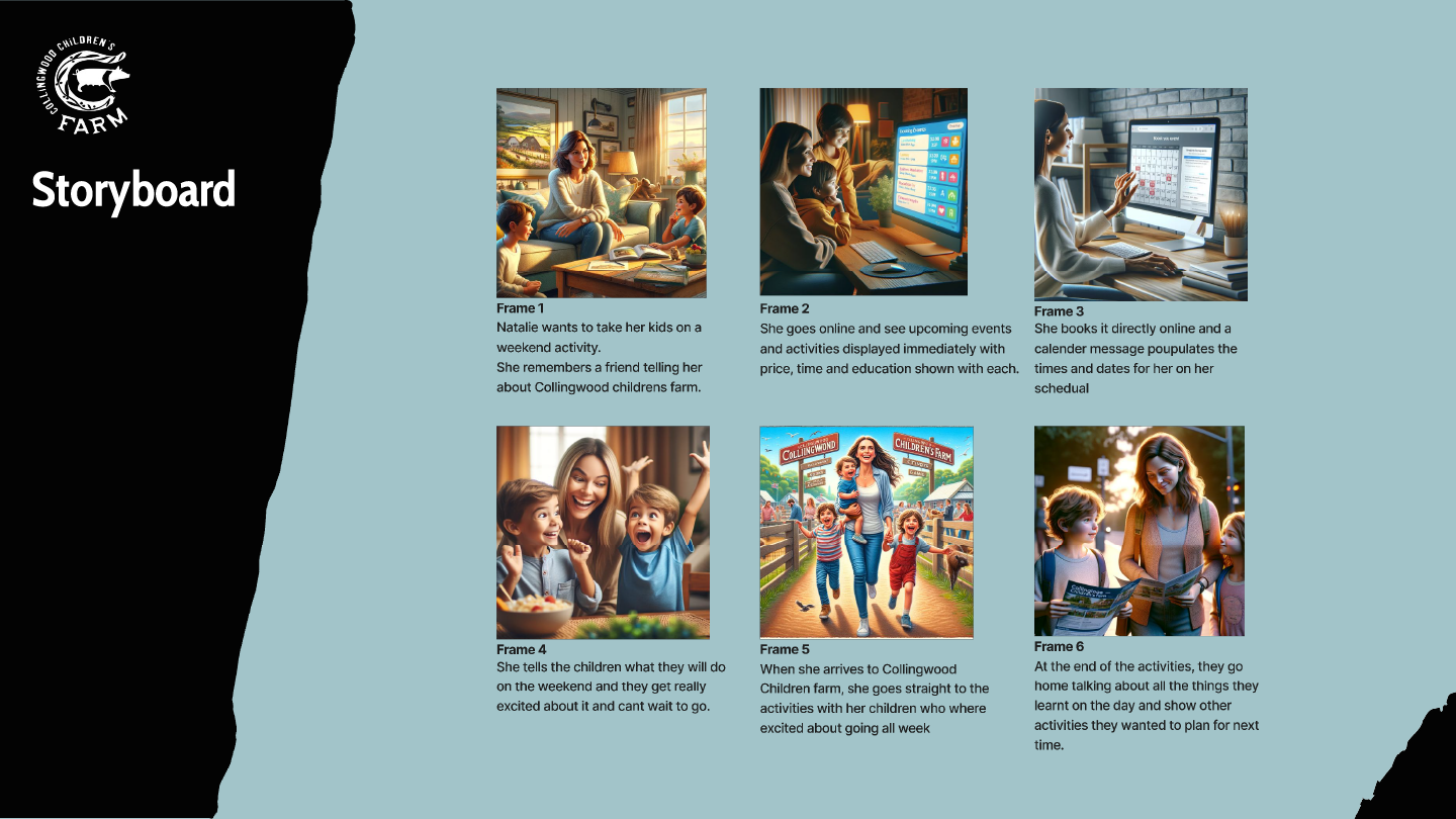
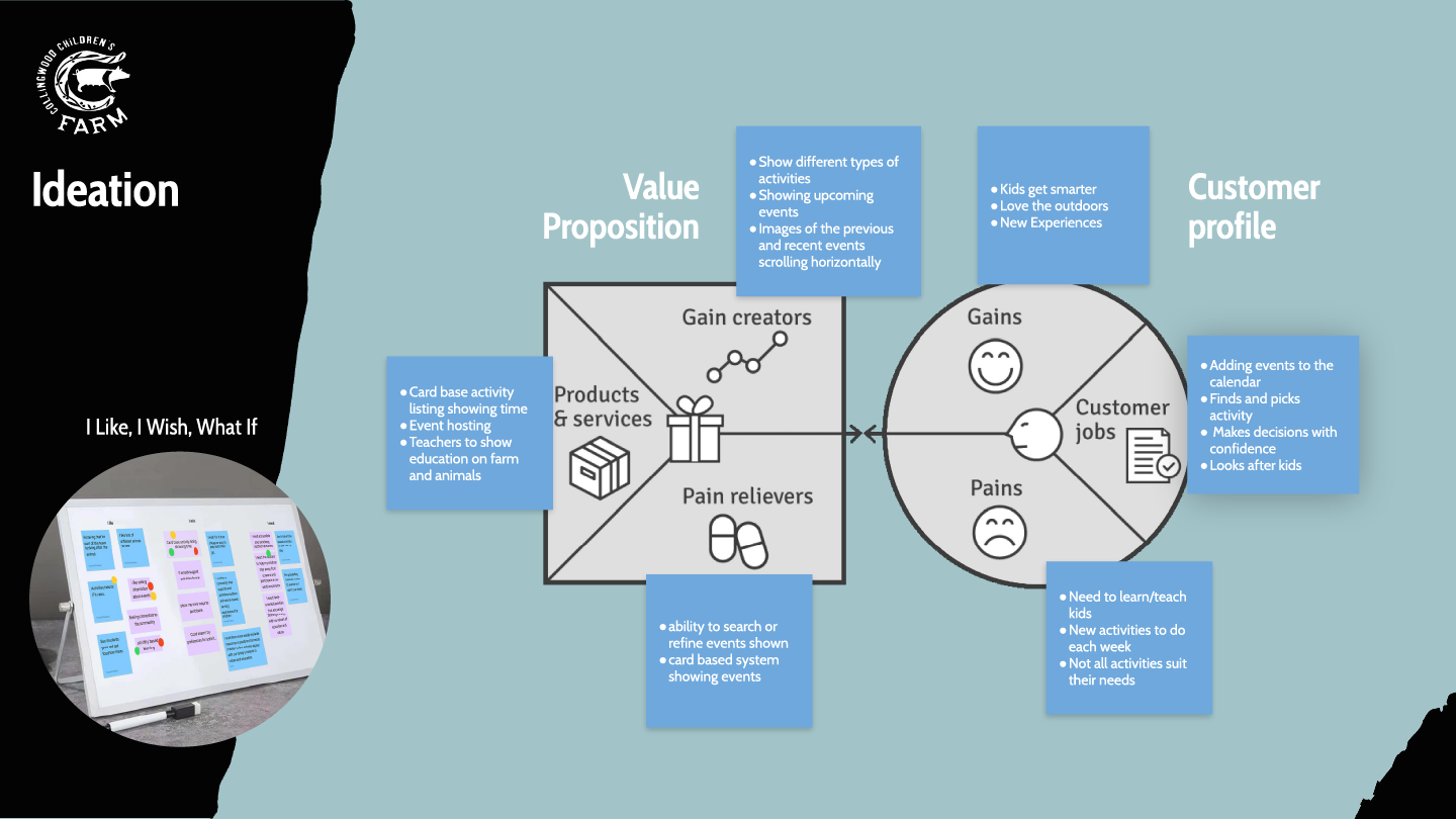
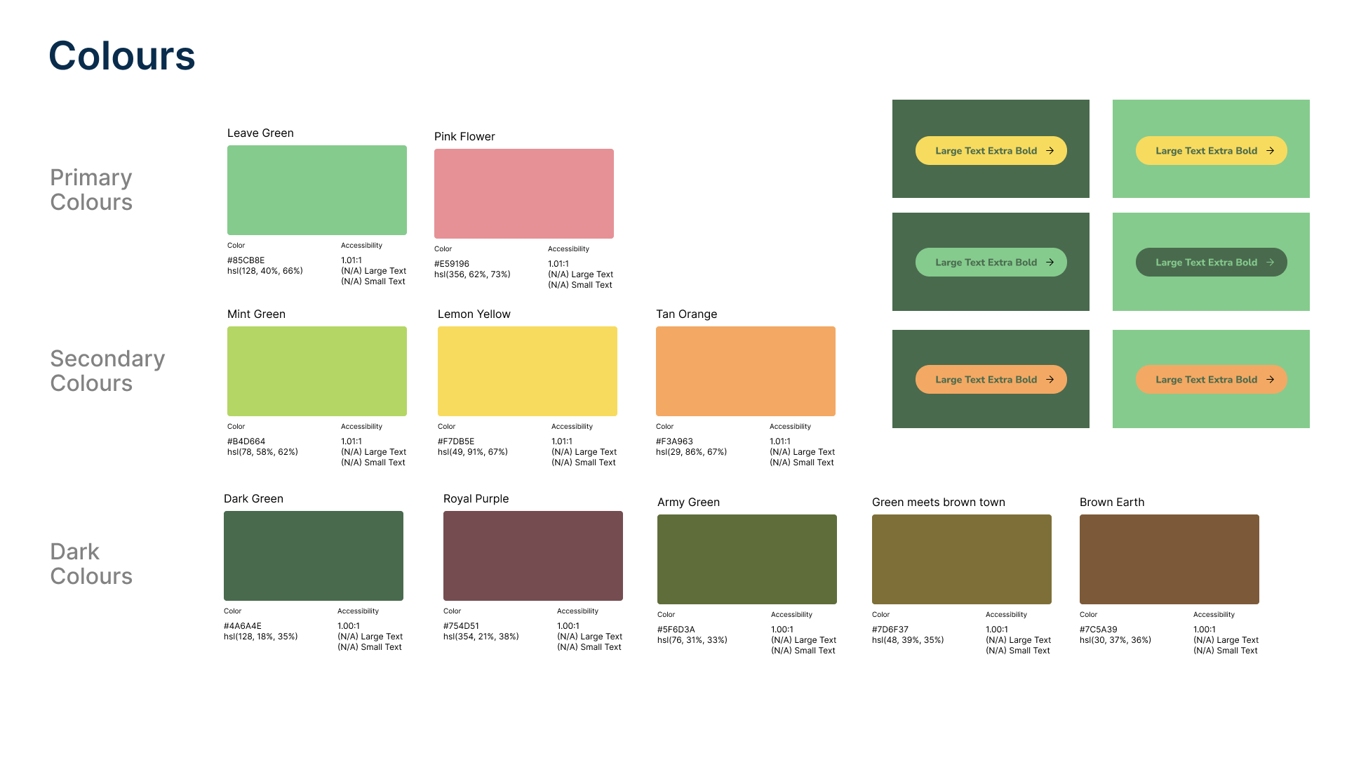
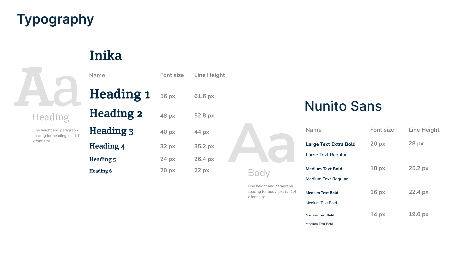
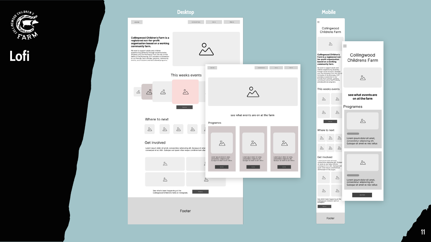
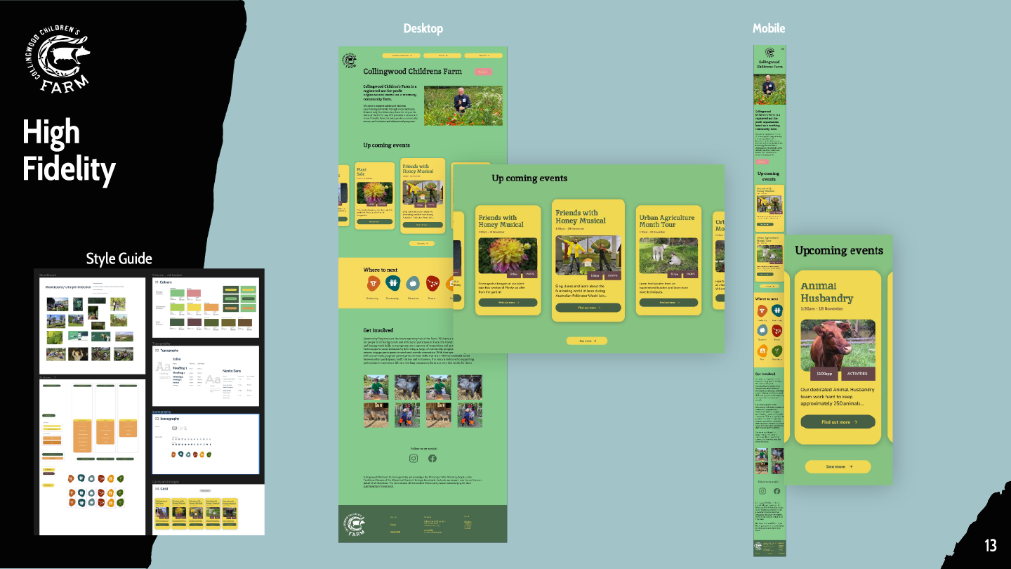
(1) Users struggled to find donate button. (2) Users wanted a destination page to see more information. (3) Users loved the colour scheme and typography choices. (4) Users liked similarity in mental model between desktop and mobile. (5) User was confused by some of the labeling such as daily activities and events
EXPLORE MORE
COLLABORATIVE UX/UI WORK
Creating seamless experiences where design meets smart solutions.
